Client
Idealist
Year
2019
Services
Product Design, Brand Design, Creative Direction
A Nonprofit Community: Making Idealist more than just a job board
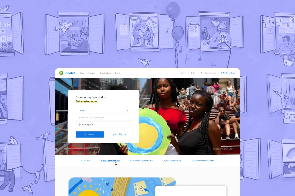
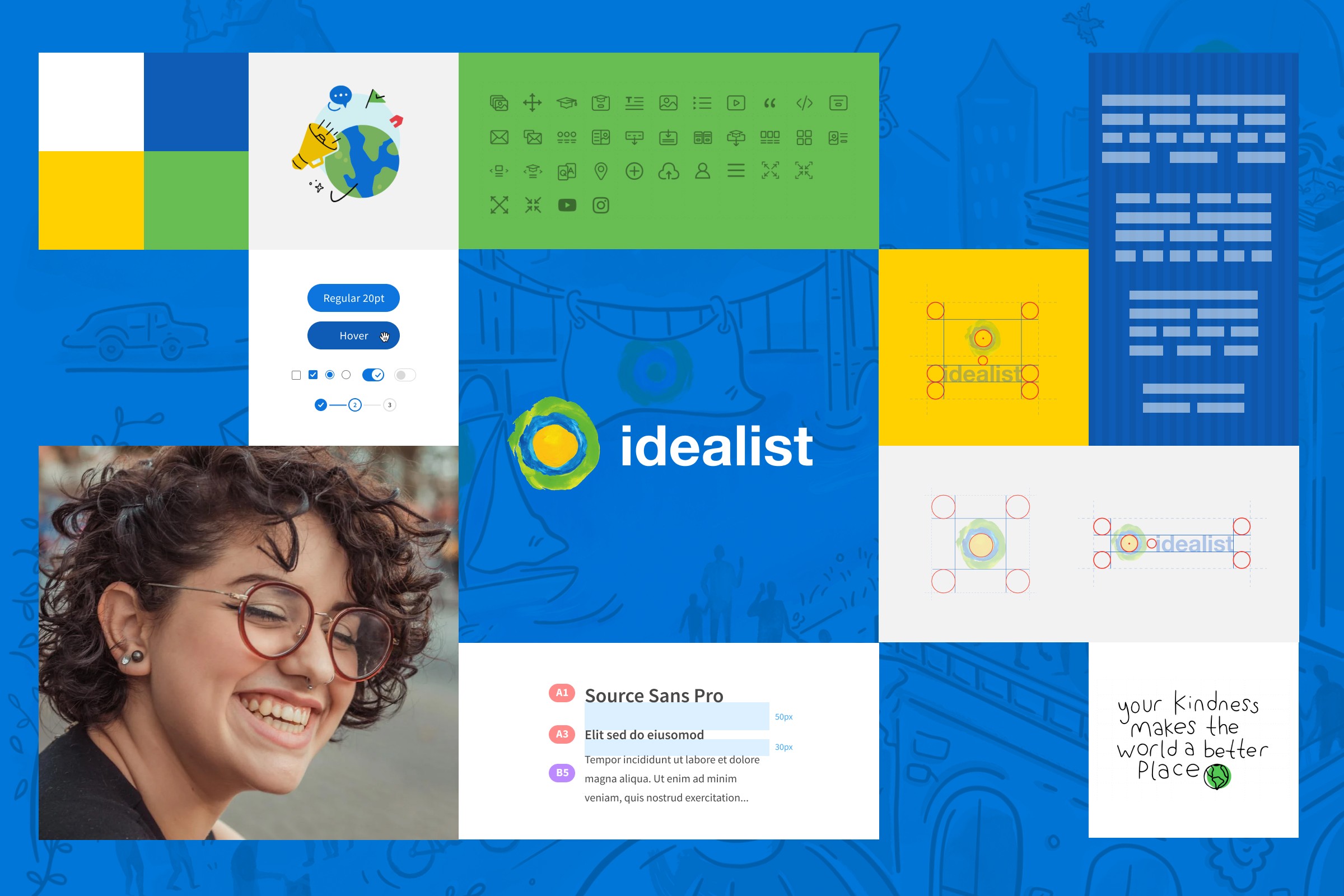
Idealist is a longstanding job board and resource platform for the nonprofit industry. For years they had been the go-to site for nonprofit jobs, but they wanted a way to better showcase their other offerings. As the lead designer, I was tasked with creating a more robust ecosystem that could highlight a broader sense of community and engagement. This included refreshing the brand, creating a new design system, implementing a new CMS for flexible page building, adapting the overall site structure and architecture, and launching new features and verticals as they expanded.
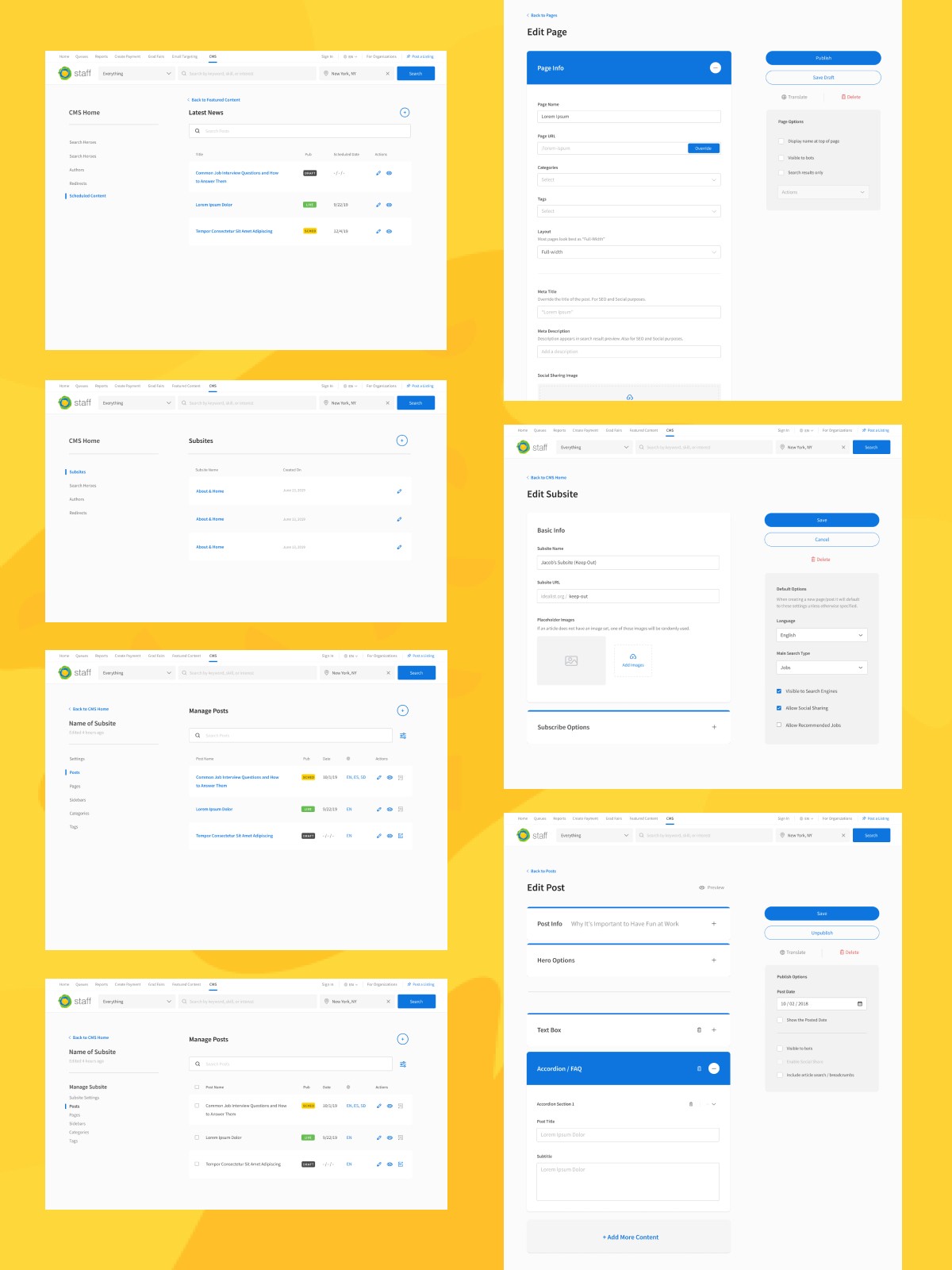
From volunteer opportunities to career resources, Idealist needed a CMS that could fulfill a variety of different needs.
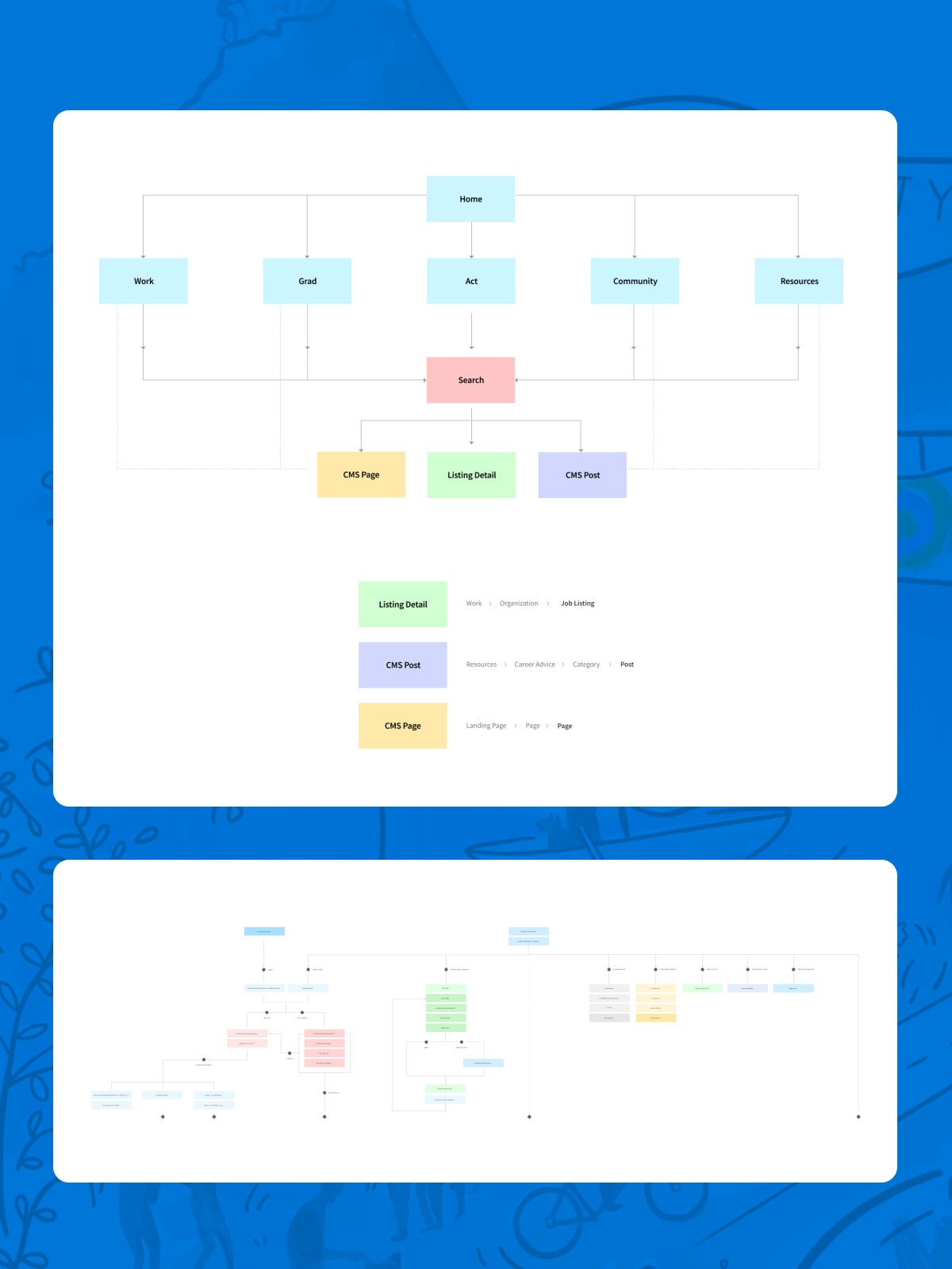
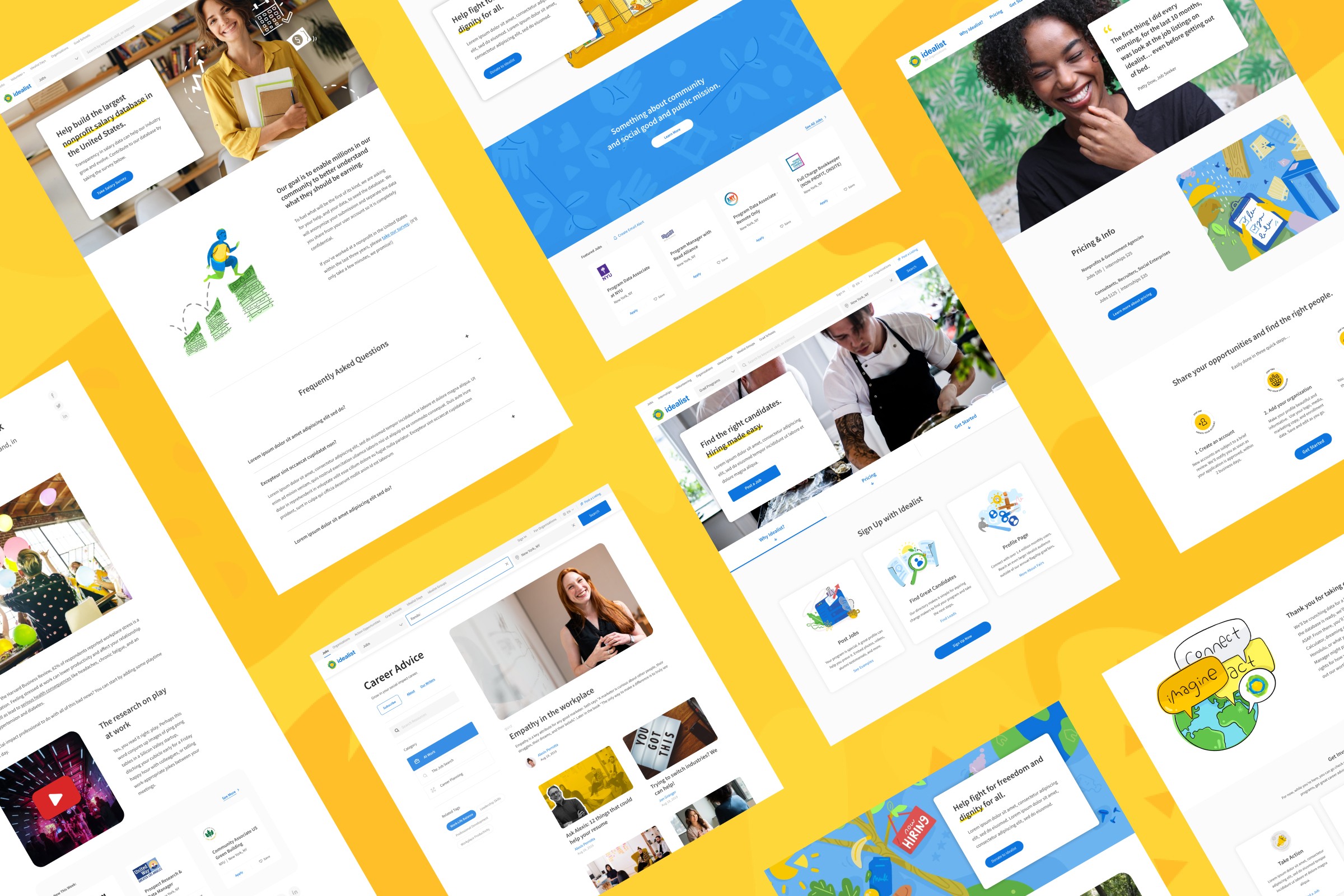
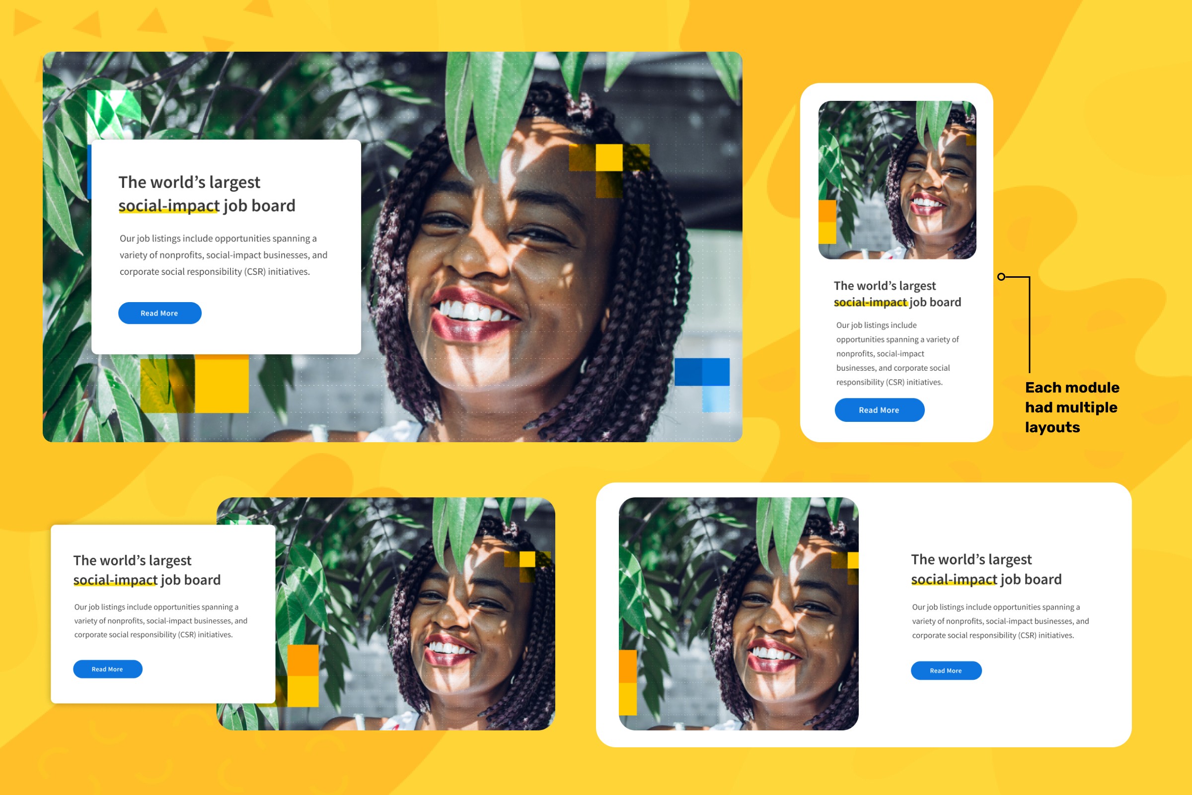
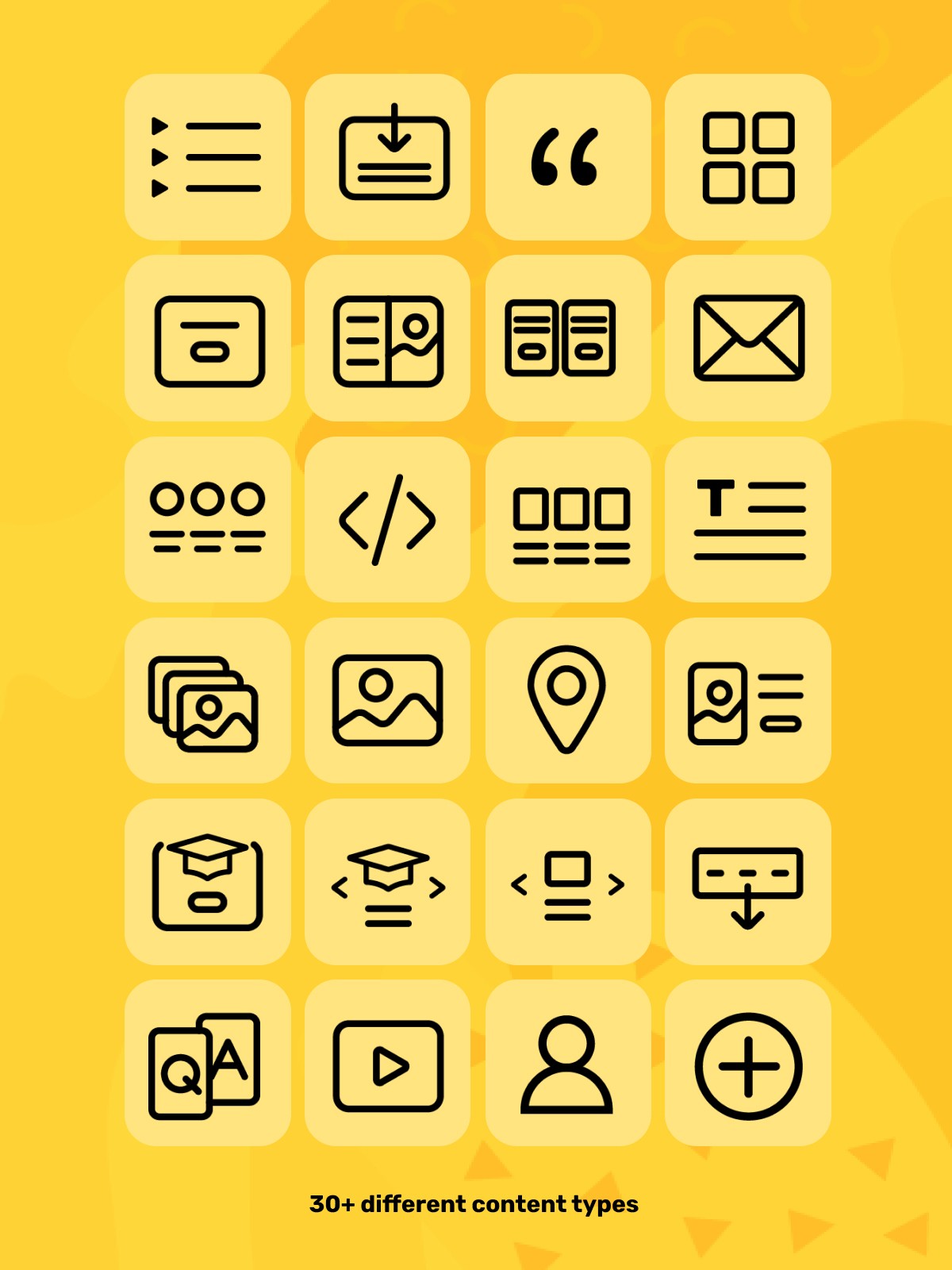
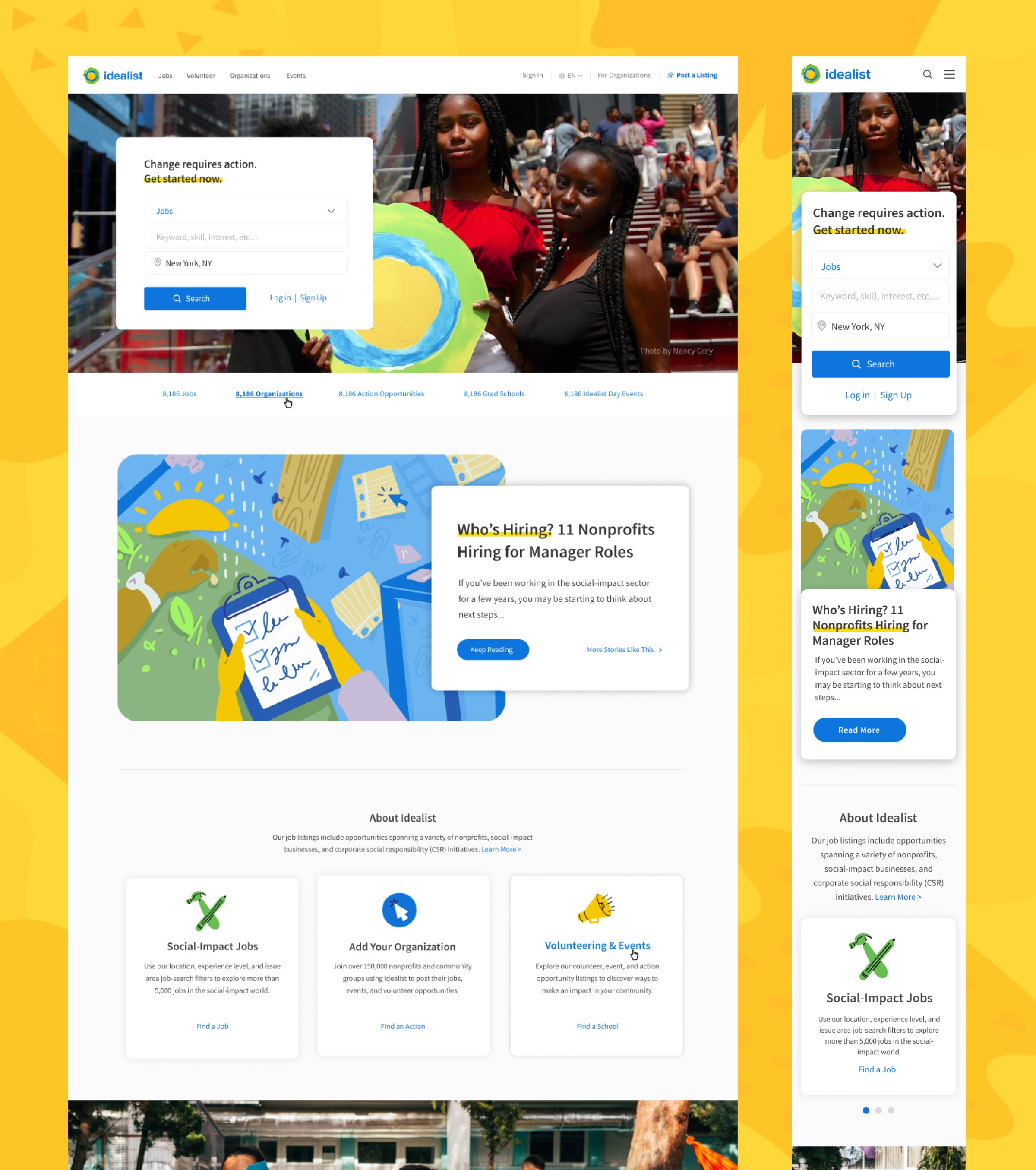
After understanding the new architecture of the site and the specific needs that each department had for this new CMS, I was able to get to work. The Community & Content teams would need layouts for their blogs and several flexible options for articles. The marketing team required many new landing pages with various sign up forms, newsletters, etc. And of course I would need to update the preexisting pages to exist in this new landscape, including the homepage. The new homepage would strategically showcase recent articles, relevant events, community spotlights, featured jobs, and give a general sense that Idealist was more than just jobs. Creating a system for this many different use cases required many different content blocks, but also the ability for these blocks to adapt depending on what kind of page they were on and the contextual content that it was around.
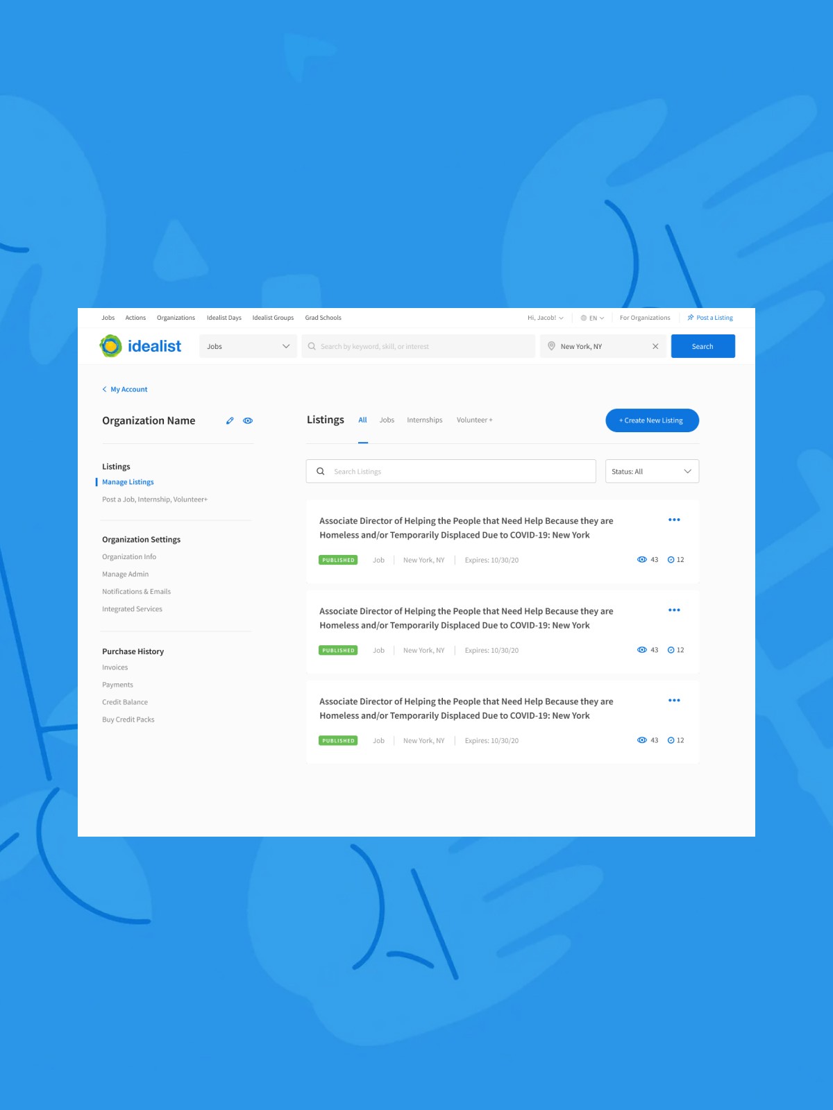
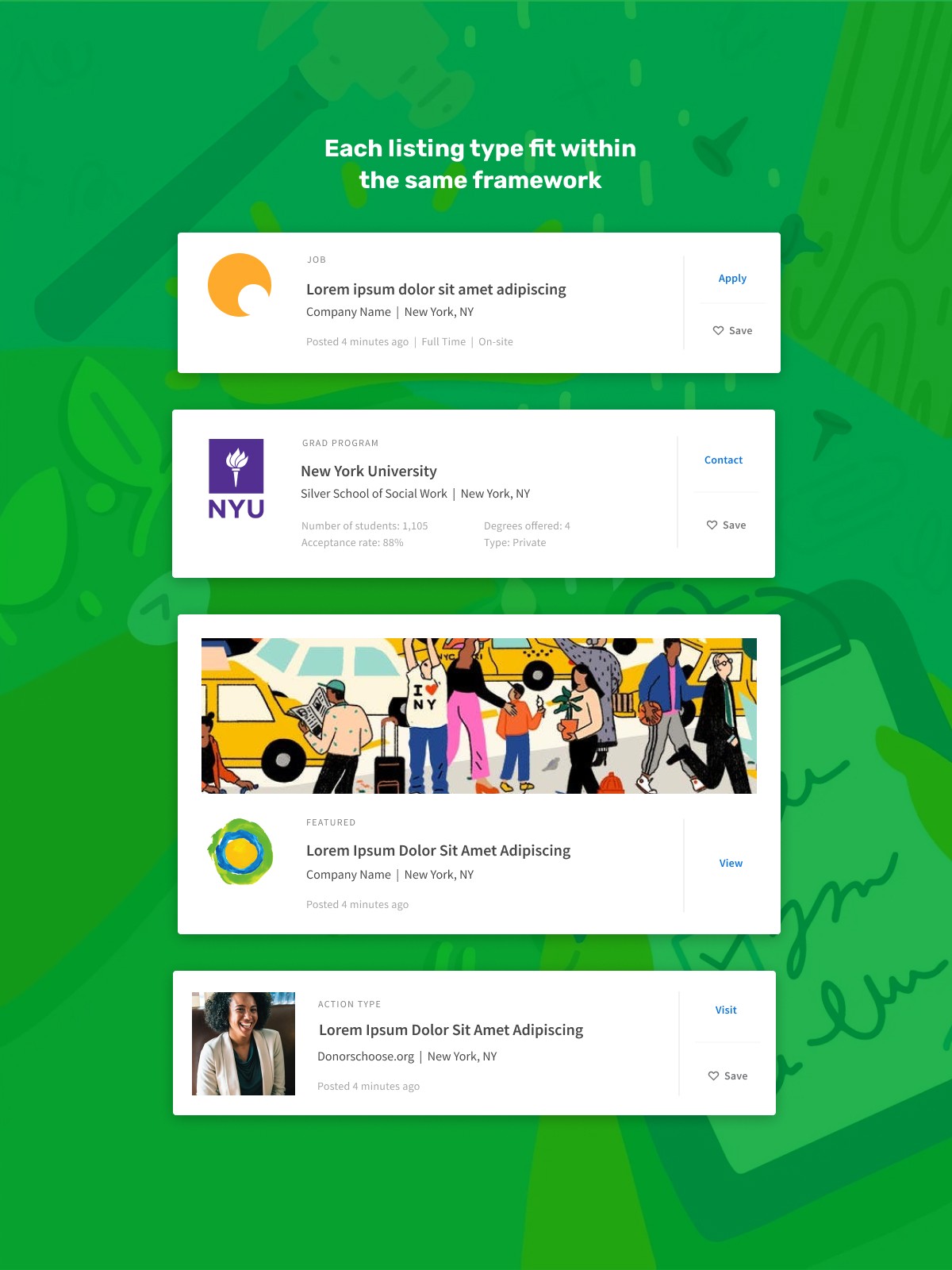
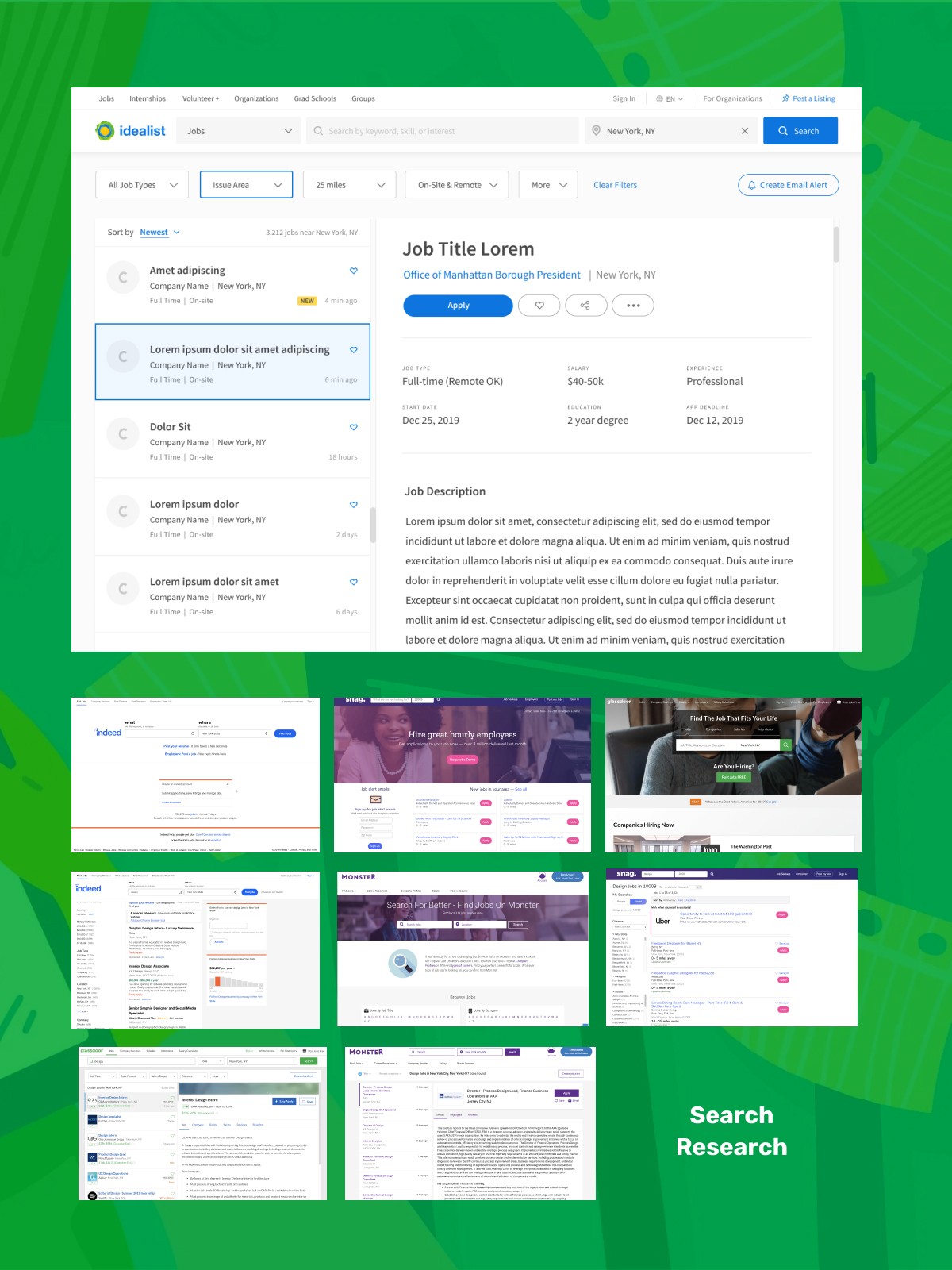
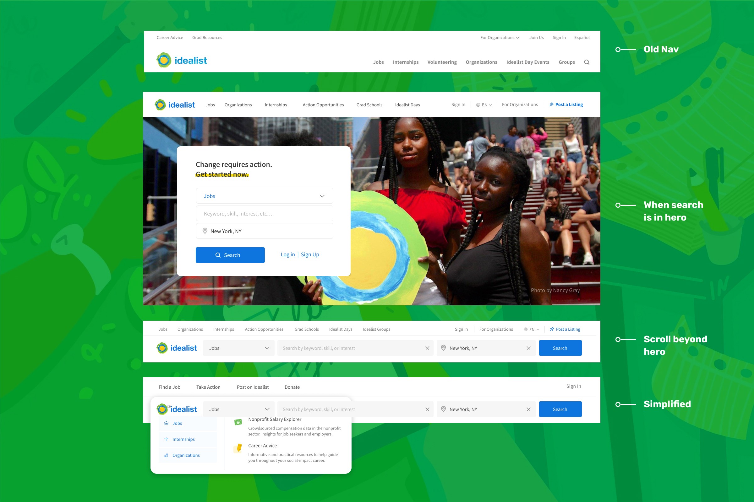
Showcasing all of the new content was great, but we couldn’t forget about the original purpose of the site... searching for jobs.
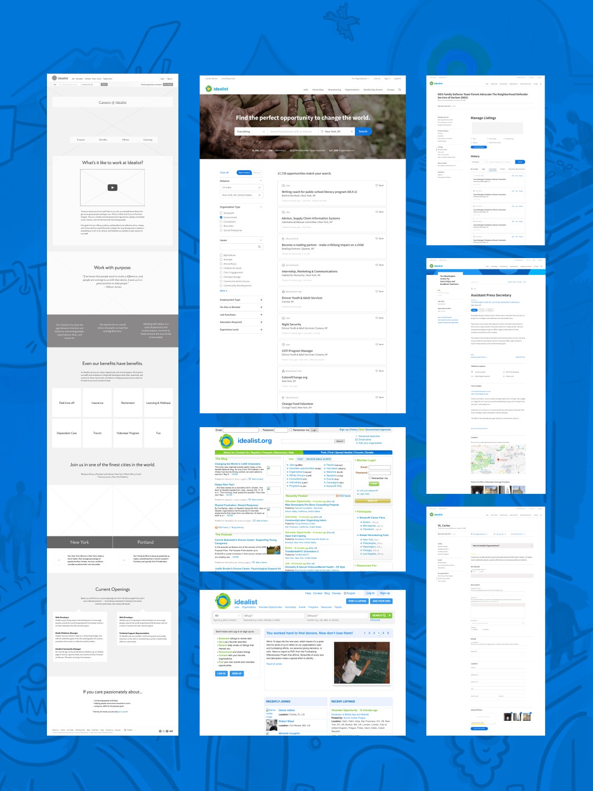
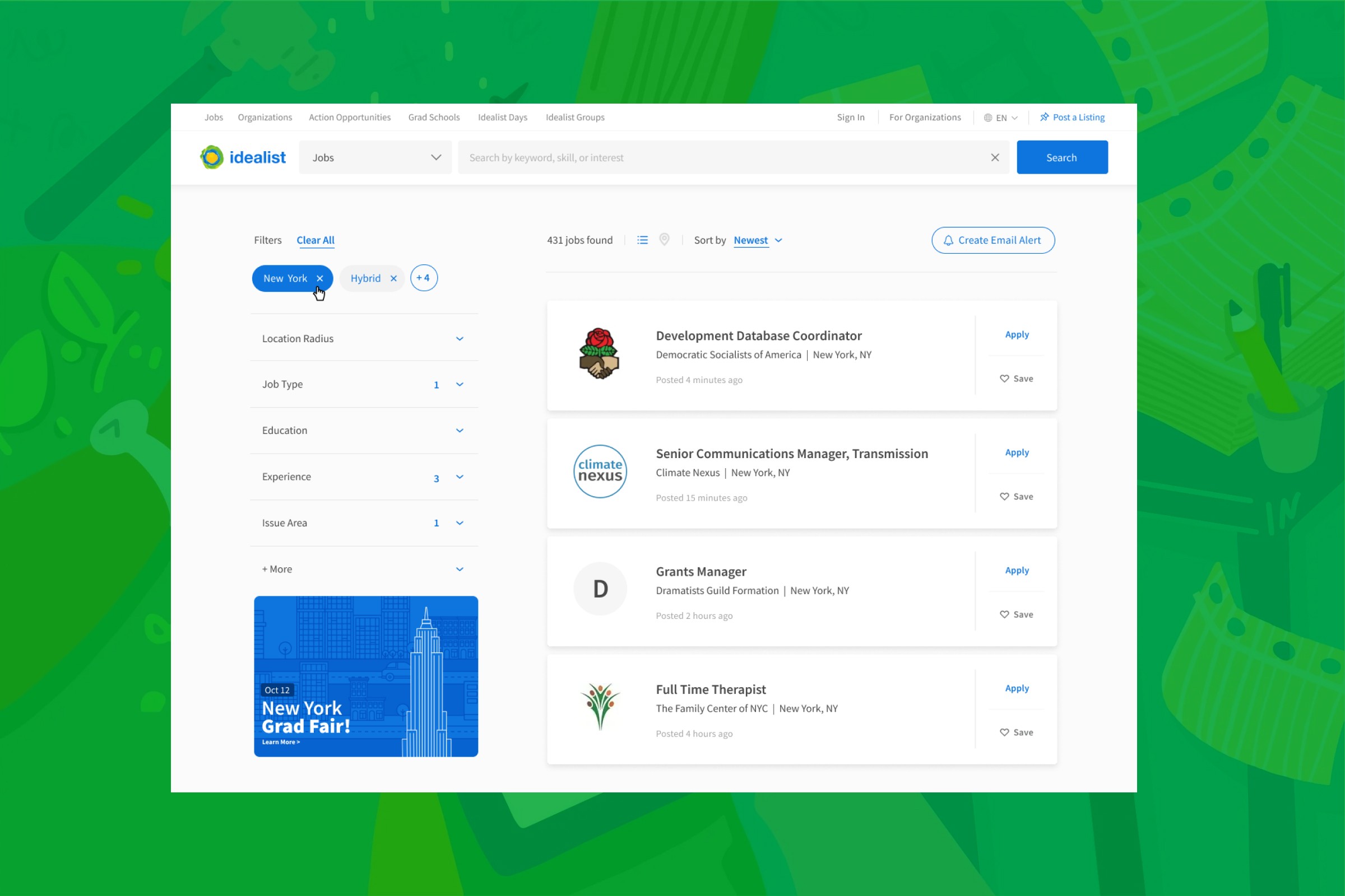
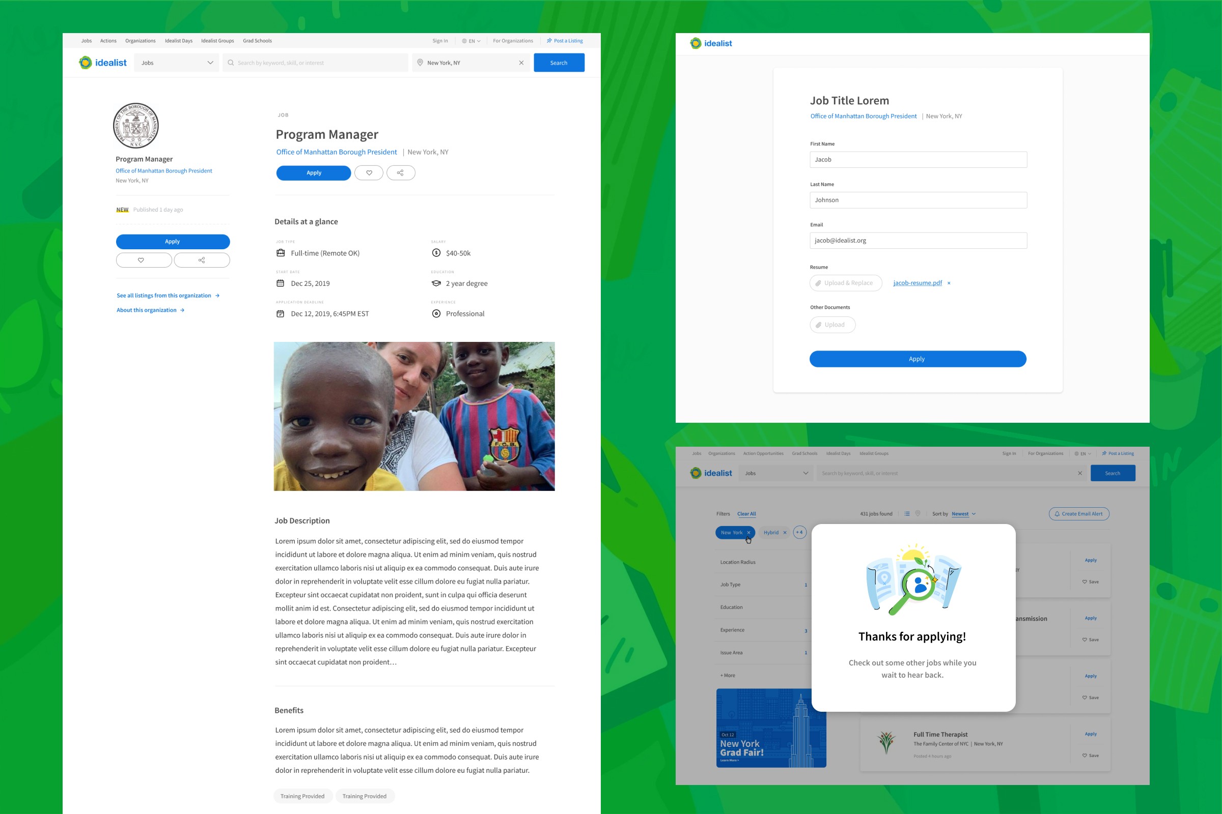
As a result of implementing the new CMS and updating the homepage, the job search results that were originally front and center were now moved to a secondary results page. This meant the hero needed to be big, bold, and feature an in your face search bar, so users would still know where to go when looking for jobs. While the rest of the homepage was editable, this search hero would be a permanent fixture. As for the results page, I wanted to ensure that it was clean and easy to read/scan as users parsed through the list of results. This new listing was standardized across multiple types including jobs, volunteer opportunities, organizations, and grad programs. The search UX remained simple, with type, keyword, and location as primary search items. I also added several filters and sort options, along with the ability to receive email alerts based on previous searches. This new search UX was prevalent across the entire site, as it was incorporated into the new navigation as well.
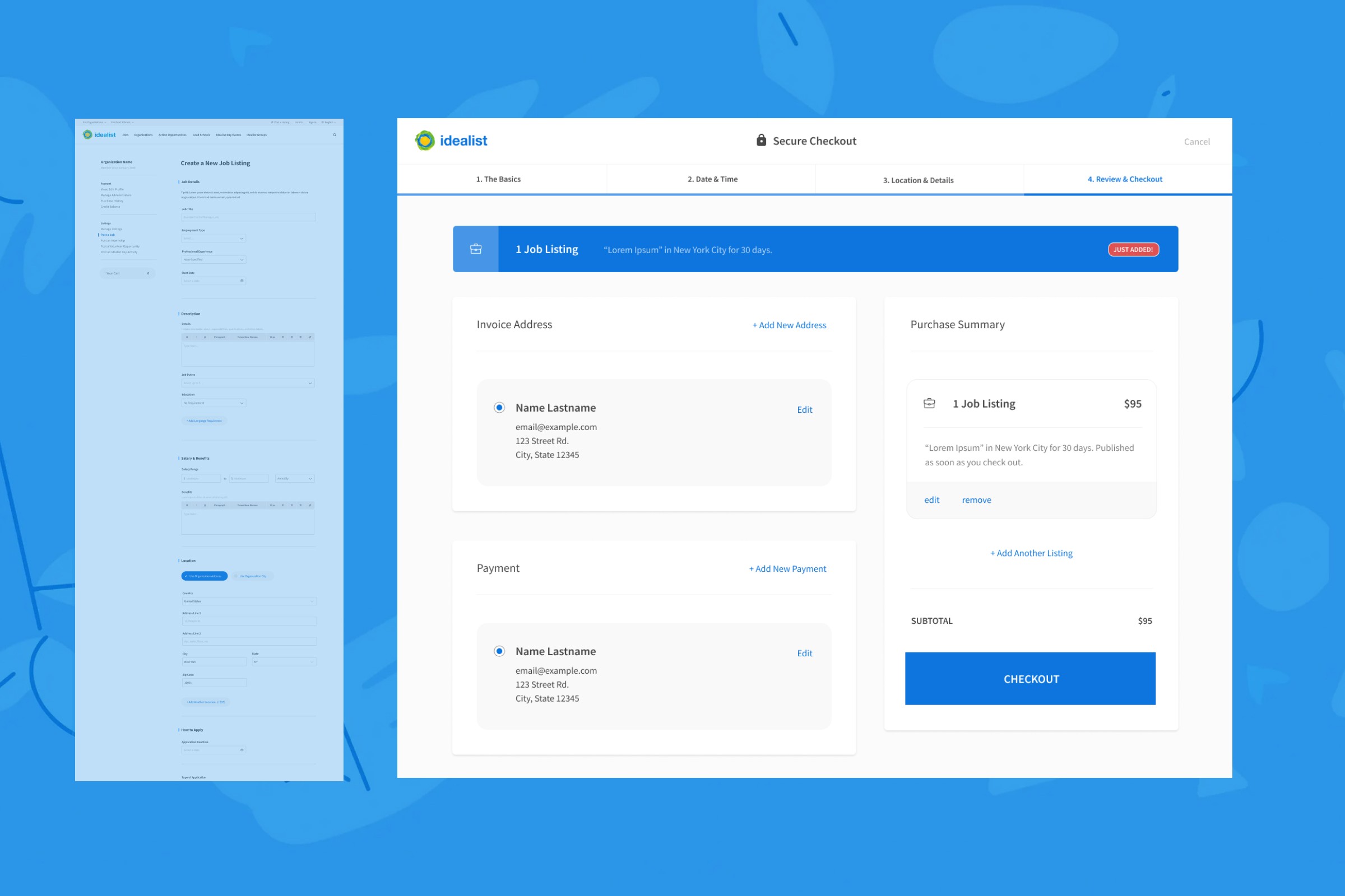
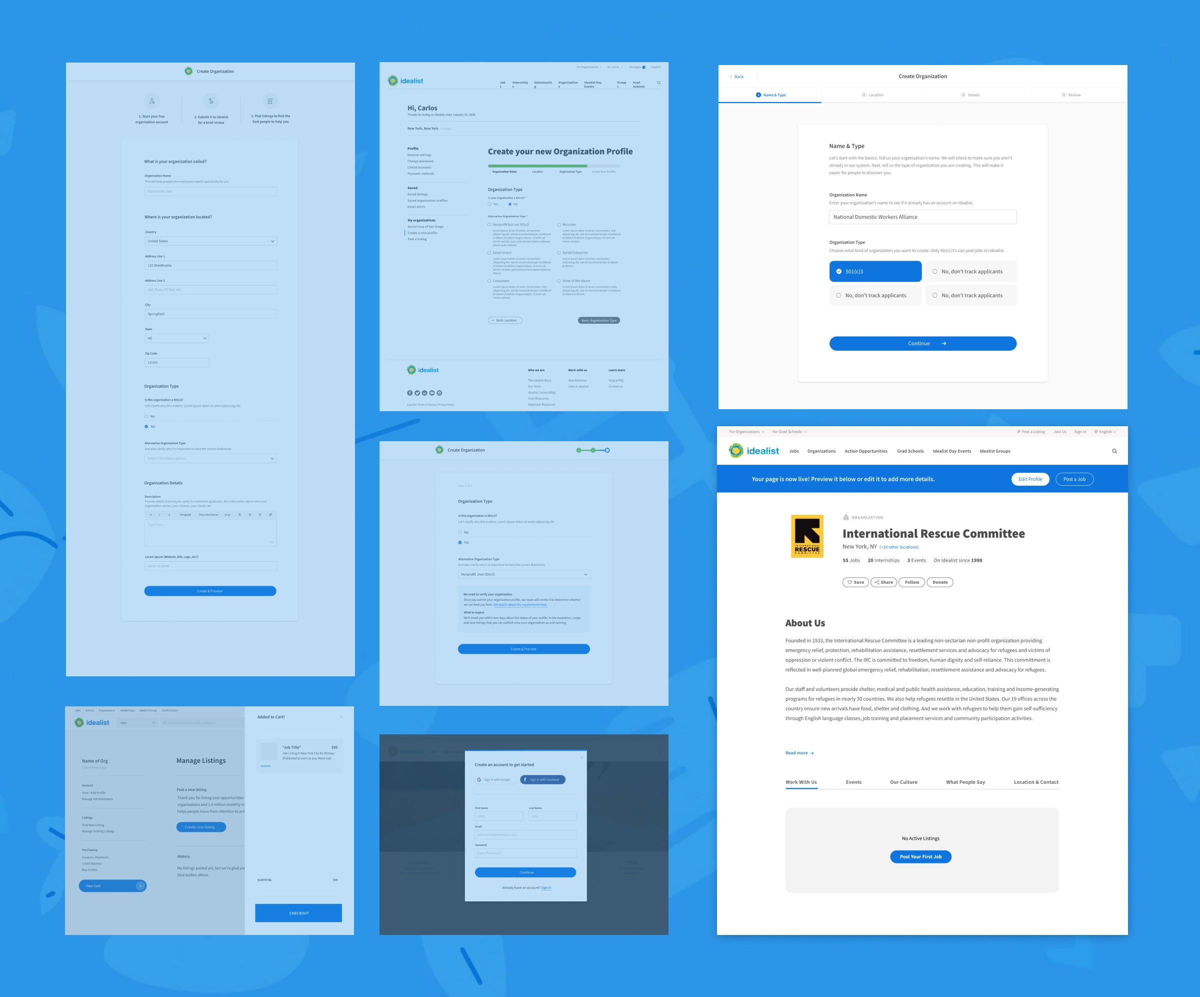
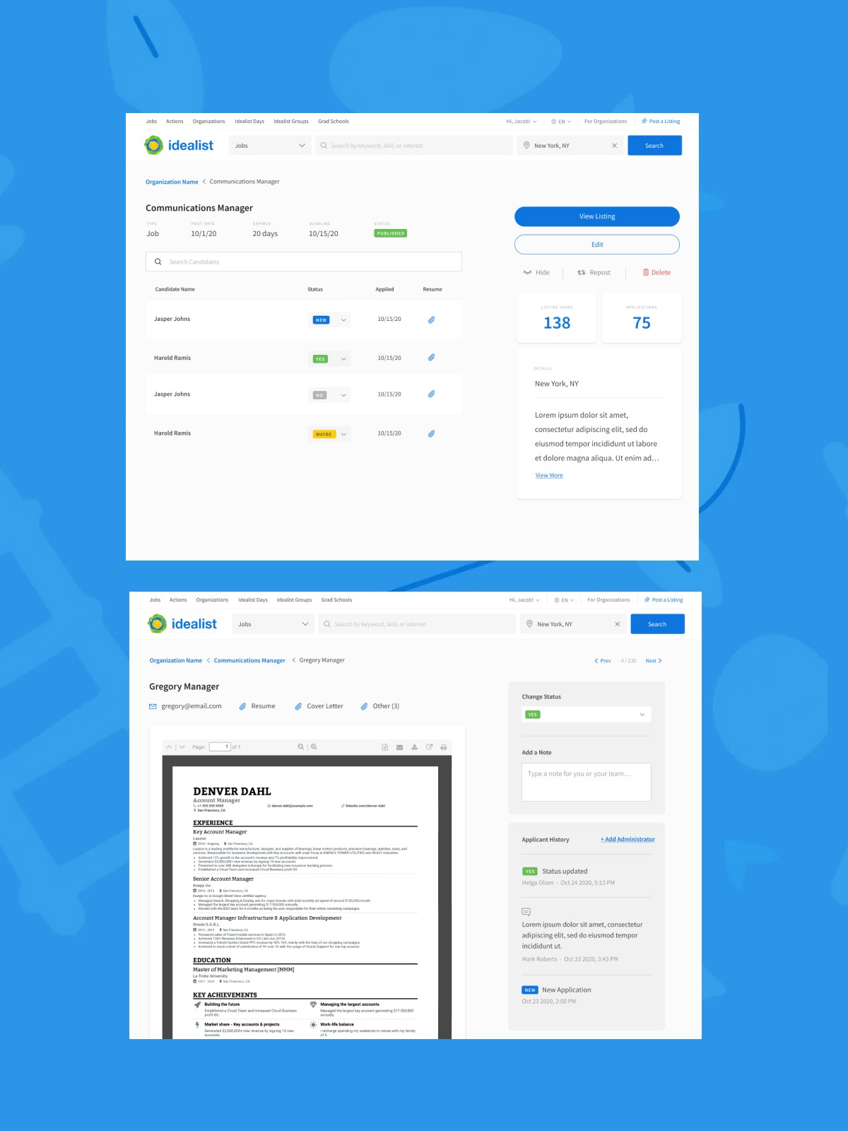
All of this work would naturally impact the administrative side of things as well. After all, organizations still needed to be able to post jobs.
Posting jobs required users to login or register as a new organization, filling out all of the required job info, and completing a checkout flow paying for the listing. This meant simplifying a previously complicated process with very long and tedious forms. I implemented a multi-step flow that made things easier to understand and faster to fill out. Organization admins also got access to special employer resources. In order to better compete in the job posting landscape, I was tasked with creating an Applicant Tracking System which would act as a new tool to better manage and track incoming applications instead of needing to rely on third parties. All of this work allowed the company to charge more to register as an organization and for individual postings.